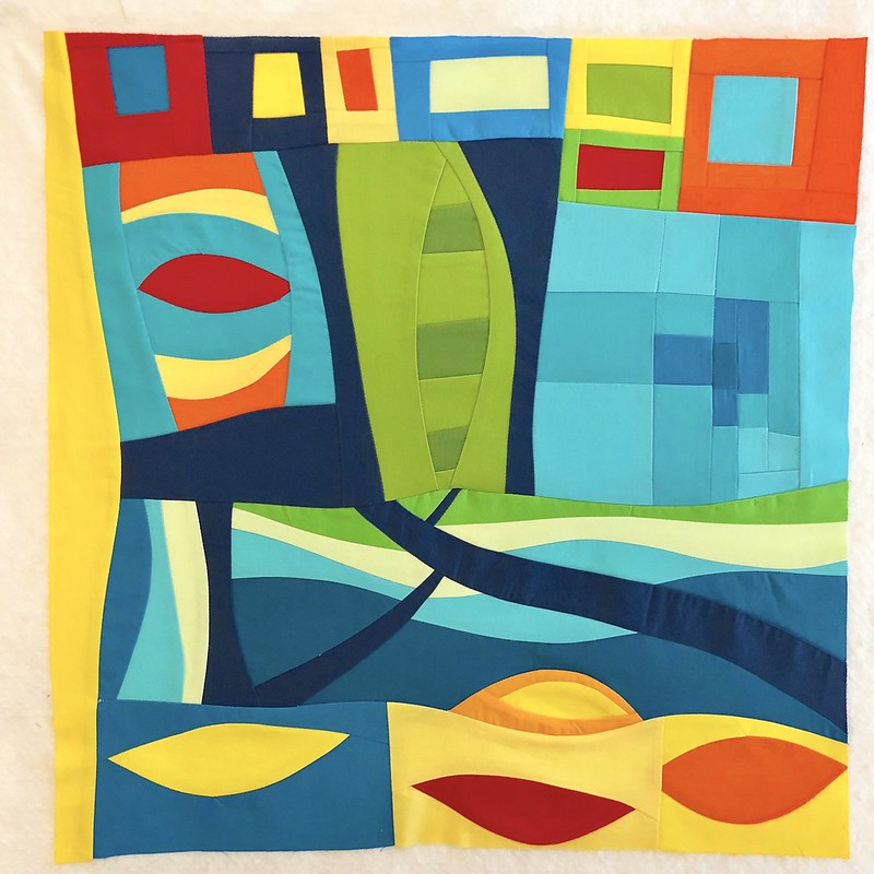
Yesterday I made this block for Karen (@capitolaquilter and she blogs at CapitolaQuilter) for my bee, Bee Sewcial. It is about 19" x 19". Karen asked us for freeform, maximalist style blocks that included transparency and connections. Also she said no pink or purple. Our blocks are always made from solids only.
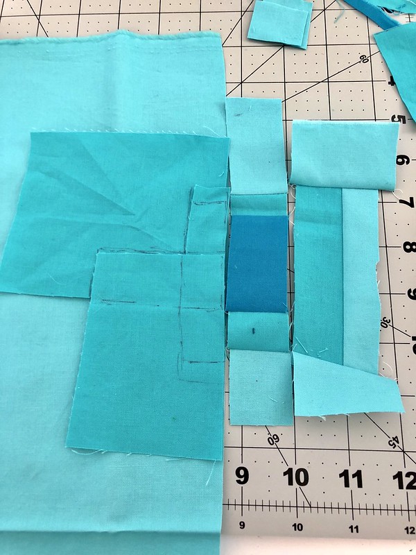
I started with the transparency concept. I spent a long time looking at images of transparency quilts and transparency artwork on the internet as I have trouble imagining how use opaque fabrics to make you see a transparency. Then I got to work, using improv and no rulers.
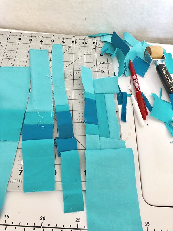
I made a number of missteps along the way, but I pushed on, as I wanted to see if I could manage something interesting at least.
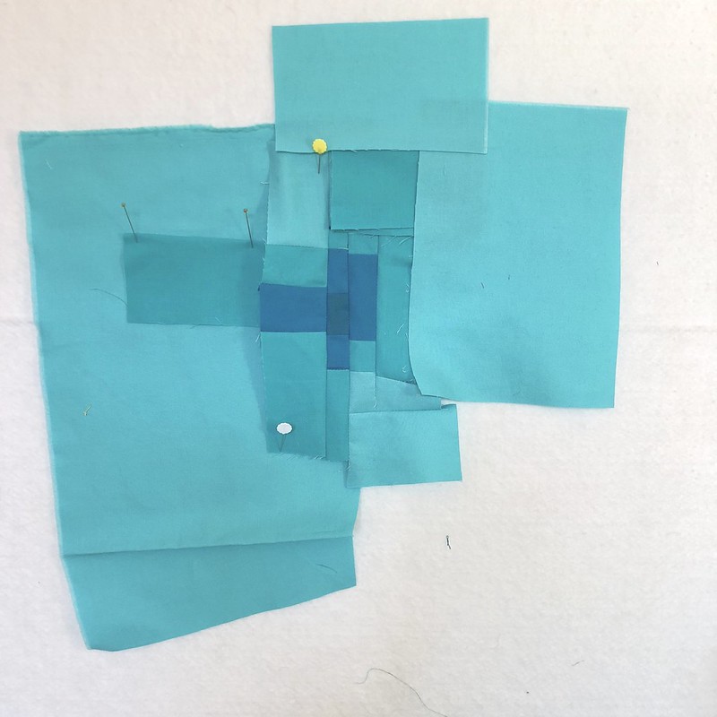
I found pinning it on my design wall (ie, a wall with a layer of batting pinned on it) helped.
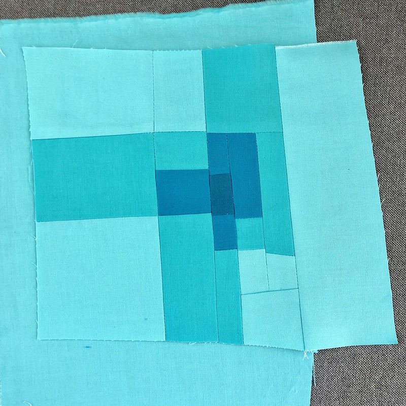
There is my result. Maybe you can see the three rectangles intersecting only in the one corner in the centre. While I am sure that it is possible to improv a transparency far better than I did, I think that part of the illusion is created by the use of very well defined shapes so next time I try I will use a ruler.
I shared this on instagram and Karen said it looked aquatic an maybe the end was affected by refraction of the water. Well, that comment informed the rest of the day's work.
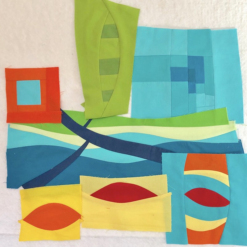
I definitely wanted to include curves in the overall piece as I love curves in improv. So my thoughts went to water, waves, pods, fish. And while I don't think I turn to pink and purple that often, I sure felt the limit of not including them. I tried to stick to a lot of bright, yummy shades of the colours I used.
For connections, I thought that a dark blue, the deep water so to speak, could make them.
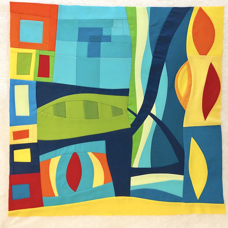
At the top of the post you see the block oriented as I designed it, with the fish or sea life on the bottom. But it looks nice oriented this way too. Adding that bit of yellow to square off the block gives it an alternative horizon line, and we all like to see those. For me, the pods become flames, the curves become the forest, the rest feels somewhat cultural and urban. But really it is what you see it to be, its meant to be pleasing shapes, colours and composition, freeform, with transparency and connections.
It's Family Day in my province today, we are having a long weekend. Enjoy!
Best,
Leanne